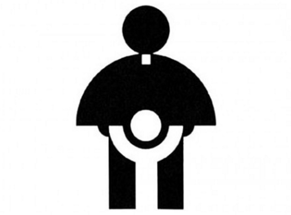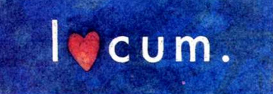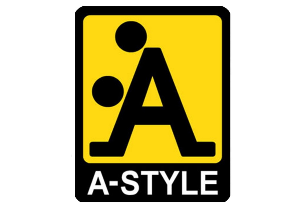
Okay, I’d be honest, for you to understand the faults of the logos, you need to engage with that dirty, naughty parts of you, that is of course, if you have one, but if you don’t, then you probably wouldn’t get it.
The brand signs that these companies chose are eye-catching enough but all for the wrong reasons. The logo you see above is from the Catholic Church’s Archdiocesan Youth Commission and it’s supposed to represent a priest protecting a child but look closer and what else can you depict ?


![Twitter users share hilarious disciplines they got from their parents amidst Chrisland school saga [Read]](https://www.yabaleftonline.ng/wp-content/uploads/2022/04/Punishmente-238x178.jpg)


